Creating data visualizations in nteract
Data visualizations are a great way to communicate large amounts of information clearly and efficiently. This guide explores different ways to create visualizations in the nteract app.
Plotting with Matplotlib and seaborn
Matplotlib is one of the most popular plotting tools in the open source ecosystem. A variety of academic and industry contexts use the Python library and it is a great starting point for anyone looking to dive into data visualization.
The nteract example notebook below demonstrates getting started with Matplotlib. Install the required dependencies for this example notebook before continuing. For Python setup, install the dependencies according to your use case.
The example below of the necessary dependency installations refer to a global Python installation.
$ python -m pip install pandas requests matplotlib seaborn
After installation, open the example notebook in the menu bar.
File > Open Example Notebook > python > Glean the Download Statistics for nteract Desktop
Navigate to Cell > Run All to execute all the cells in this notebook.
This notebook uses the GitHub API to fetch download statistics for OS-specific versions of the nteract desktop. It renders the number of downloads per release. Scroll to the last cell in the notebook to see the following example.
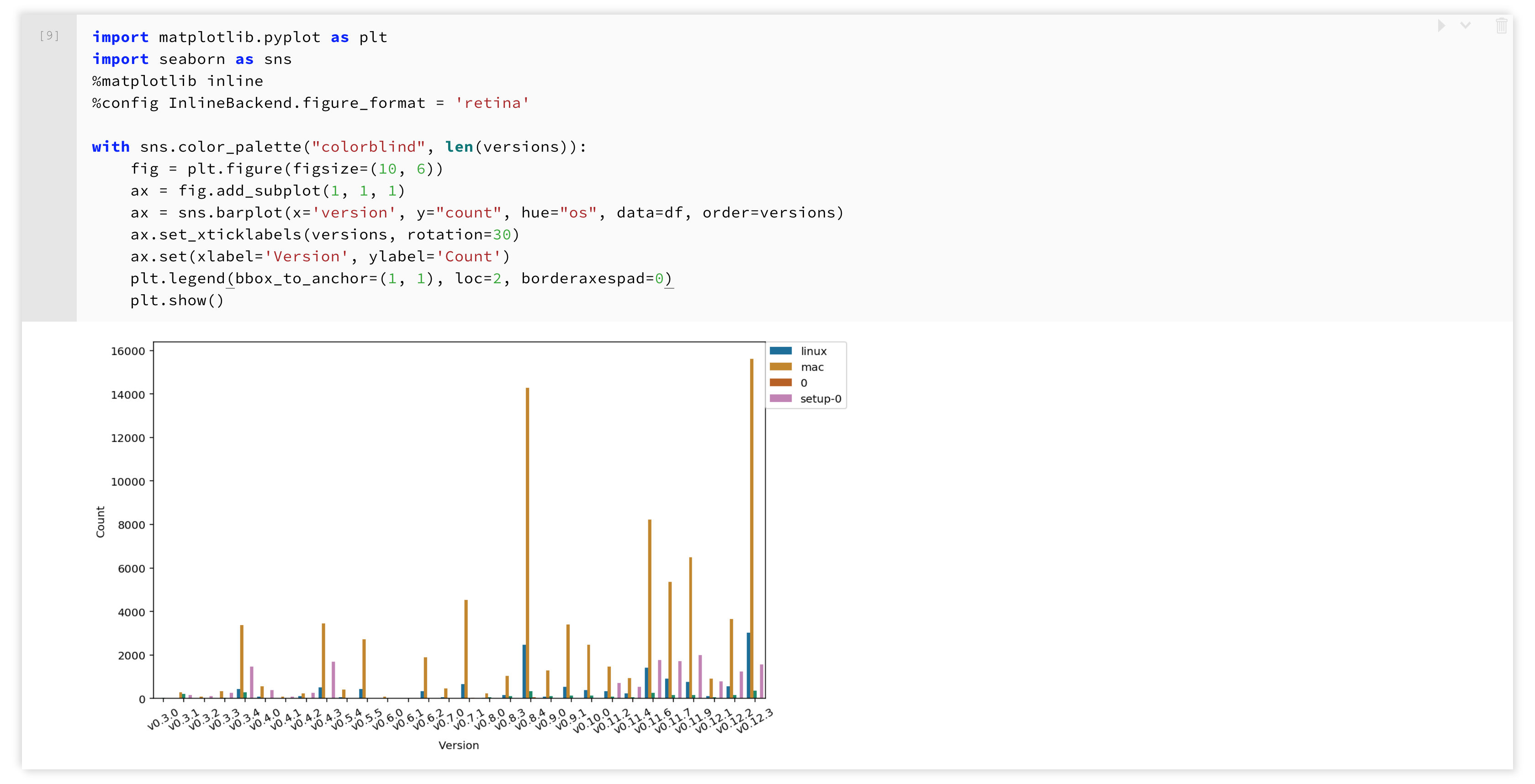
The plot renders as a static image. Save the image locally or export this notebook as a PDF with this image inline.
Visualizing with Plotly
nteract also provides a custom renderer for rendering visualizations using Plotly's open source visualization tools. This example notebook below demonstrates Plotly in nteract.
Prepare the plotly Python package installation before continuing.
Example:
$ python3 -m pip install plotly
Navigate to the selection below in the menubar.
File > Open Example Notebook > python > Gallery of Plotly Plots
This notebook defines a plotize function that takes the data and layout of a visualization and renders it inline using the Plotly transform.
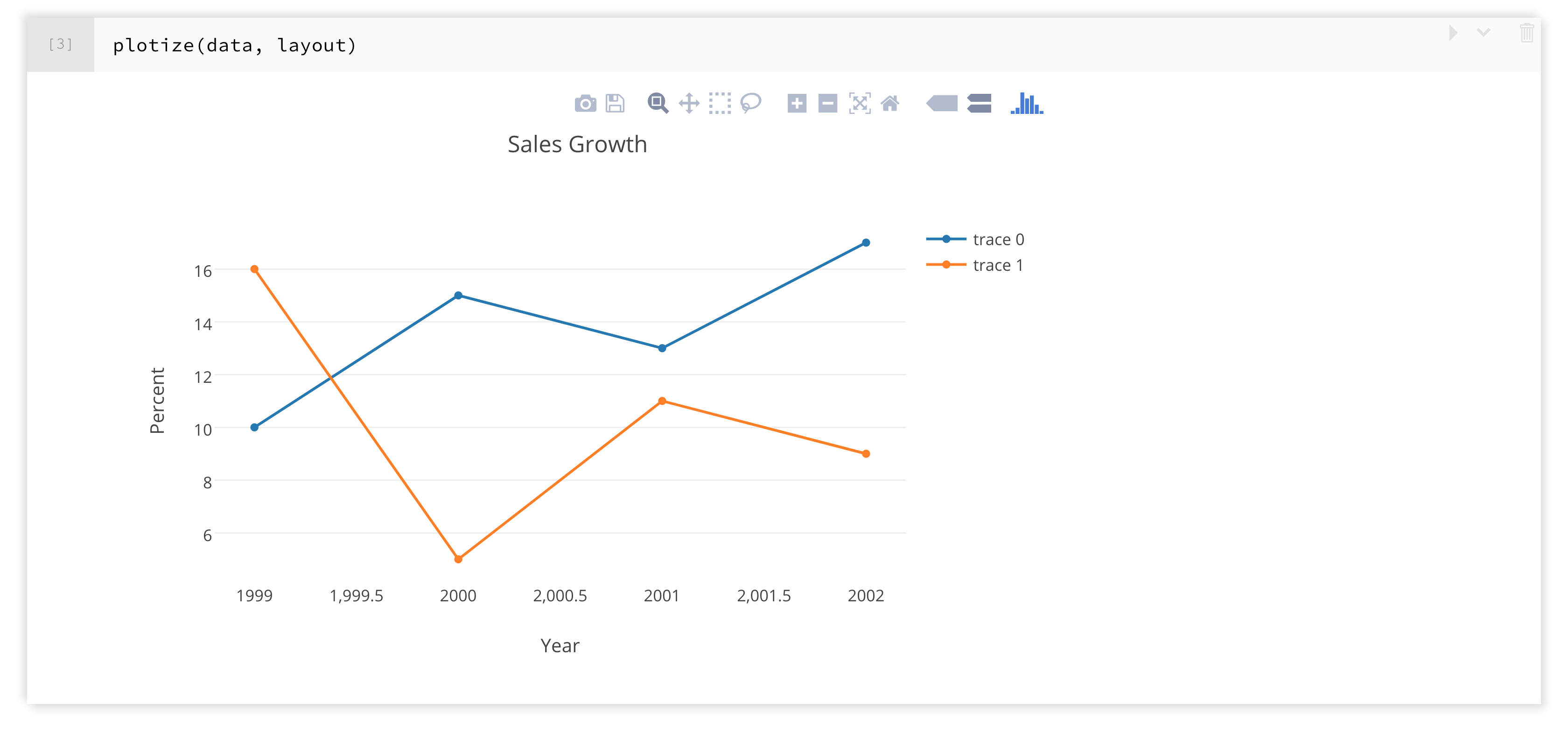
Zoom in and out of a visualization, enter full screen, save the image, and more within the transform.
Exploring with the Data Explorer
nteract ships with the nteract Data Explorer, an efficient workflow tool for creating data visualizations. The data explorer provides several visualization and customization options instead of writing your own visualization code.
The Data Explorer example below uses one of the example notebooks.
Navigate to the following selection in the menubar.
File > Open Example Notebook > python > Try the Data Explorer
The last cell of the notebook shows a data frame rendered within the Data Explorer. Several visualization formats for the data are on the right. From top to bottom, view the data in tabular format, a bar plot, a scatter plot, an area plot, a network diagram, a hierarchy diagram, and a line plot.
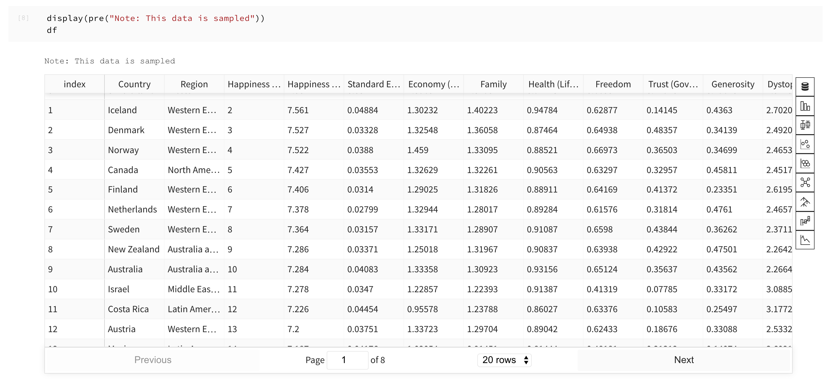
Each visualization type gives you the options to modify the category, filters, color palette, and more for each visualization type.
Which visualization option should I use?
nteract has many available visualization options. Use the table below to help you with selecting an option that best fits your project needs.
| Visualization option | Project goals |
|---|---|
| Matplotlib, langauge-specific plotting tool | Publishing, exporting to a static format |
| Plotly | Familiarity with Plotly, predetermined specific visualization format |
| Data Explorer | Exploratory data visualization, no custom needs, sharing notebooks using nteract |